

UIC Brainstem Revamp
After working with Dr. Unnerstall on my Research Project, he hired me to revamp his department's sectional anatomy app, called UIC Brainstem. The goal was to update the app, which had been designed in the early 2000's using Flash, to make it HTML5 compatible and to improve the overall flow of the interface. It also had to be made in a way that would be easy to edit by future professors. Based on these criteria, I suggested using Articulate Storyline 2, which has a very easy interface (almost identical to PowerPoint, which most professors are familiar with), and the coding aspects are made into very simple forms that anyone can use. The online support is also excellent. From this reasoning, Dr. Unnerstall agreed with me and we started.

Before

After
A Simple Tweak
I was familiar with the app, having used it myself while taking his Neuroanatomy course, and from my own experience I immediately had some thoughts as to how the organization could be changed.

Home page
The first page that appears when you opened the app was completely blank! And hitting the "Home" button on any slide page took you back to this blank screen. Not very useful. This seemed like a missed opportunity to help guide students and introduce the content and instructional goals.
I added a page with a brief description of what the app was for and who made it--the Neuroanatomy faculty at UIC.It also defines the strategy that went into separating the slides into two--largely, it was because trying to cram everything onto one slide would be far too busy, but also there was a degree of sorting things into functional categories. Before this, it seemed like there wasn't much rhyme or reason for why things would be on one slide or the other.
Navigation
App Navigation
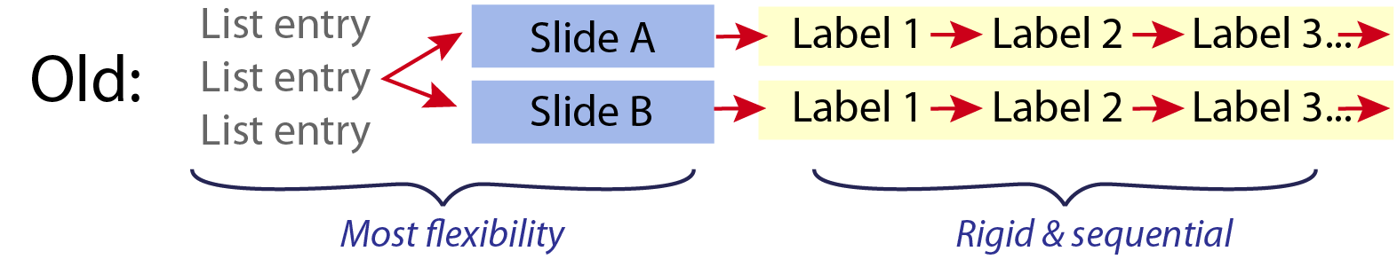
The navigation overall is what needed the most work, in my mind. While you could jump freely between the sections, each having two slides, you could only view the labels sequentially if you wanted to read the description of the structure, or you could look at all of the labels at once, but you still had to click through each one to find the description.

The slides are in a logical order, ascending through the brain so that students can follow tracts and see how structures transform as they travel through the brain, so a sequential approach makes far more sense when working on a larger scale. And even still, I didn't want to force students to click through view that they know well, so they can easily jump from section to section.
Conversely, when a student lands on the desired slide, they should be able to explore it freely, so there is where I built in the most flexibility. Once they have finished a slide, they can hit the next button to reach the next slide in the sequence, or they just as easily can use the menu to explore other areas.
Page Navigation
Once I decided on how the overall app would be navigated, I needed to address how each page would look. While I decided that I would stay to the overall layout--navigation menu on the left, large viewing area on the right, I knew that I needed to completely revamp the way students navigated through the slides.
Previously, to move from slide to slide, if you wanted to go in sequential order, you had to first find your current slide on the list (it wasn't highlighted in any way), flick your eyes to the title to see whether you were on A or B, find your spot in the list again, and then select the next slide. This felt a little chaotic and distracting.

It was very easy, working with Storyline's interface tools, to make it such that the section was always highlighted. I also moved the slide selectors to the section page itself, which also would display your current view as highlighted. This made it very easy to find where you are in the stack, toggle between A or B, and use the previous and next buttons to go in a sequential order.
Labels and Descriptions
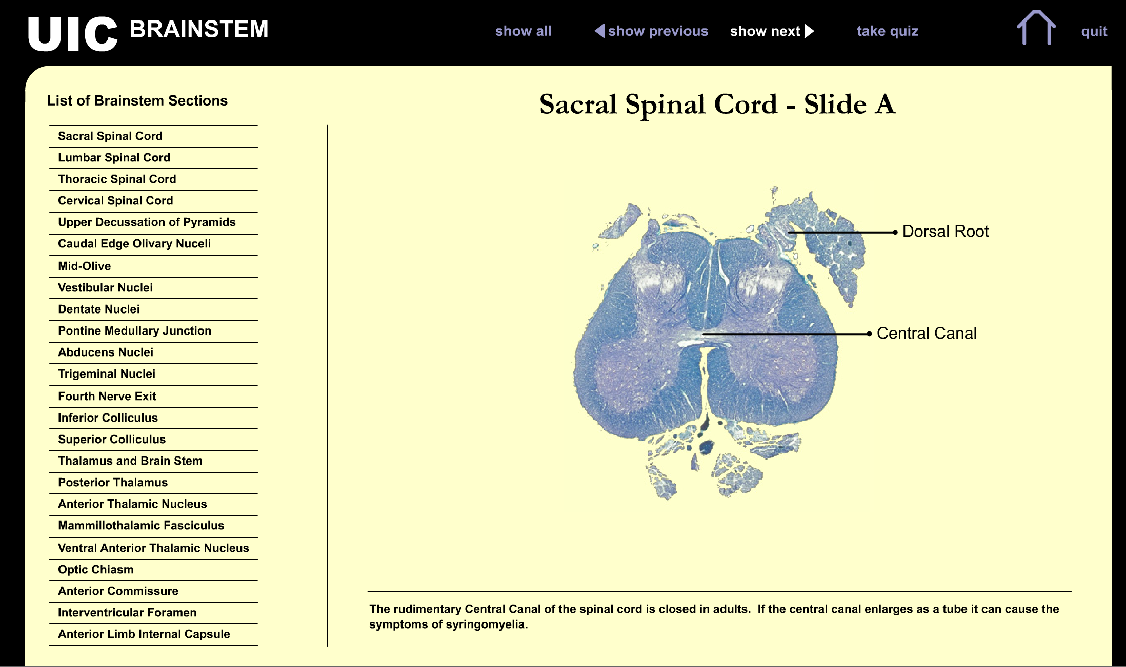
Each section was divided into two slides. Each slide had the same image, but a different set of labels. Hitting "Show next" took you one by one through the labels, making a new one visible with its description. While I presume this was to reduce the amount of information and noise on the screen, it created too many mouseclicks to find the information desired. As a student, Ioften used the "Show All" button so that I could see all the labels in relation to each other, and it took several weeks to even notice that there were descriptions included.

Furthermore, when the description was up, you had no indication of which labeled structure it referred to, aside from extrapolating that it was the label that was visible in the furthest clockwise position. I addressed this by having a highlighted box to the right side of the image--it's much closer to the information and much more noticeable. I also added a title to the info box that corresponds to the labeled structure.
We're Live!
The new UIC Brainstem app is currently live and being used by neuroanatomy students. You can find it here. You can also, probably for a limited time, see and play around with the old version, which is still online here. I hope to hear feedback from the students and professors soon, and report back!